Exploring an Open Source Hyperspectral Image Dataset
Some visualisations for an open source hyperspectal image dataset
Introduction to Hyperspectral Imagery
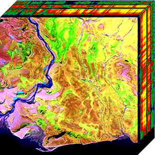
Hyperspectral cameras simultaneously capture spatial and spectral information and produce hyperspectral image cubes. Each pixel in a hyperspectral image contains a spectrum from near infrared (NIR) to the visible; unlike cameras we are all familiar with on our phones which only capture red, green, and blue. These images are obtained by quick successive aquisitions of narrow contiguous spectral strips much like the line scanner in a photocopier. This is known as push broom scanning. Figure 1 shows an example of what a hyperspectral image cube looks like.

Applications of hyperspectral imaging technology include object detection and classification by combining object shape and spectral signatures. It is the spectra that reveal chemical composition and provides a unique insight unobtainable from ordinary colour images.
In this blog post, we will explore and visualise some of the features of hyperspectral images.
An Open Source Dataset
Despite the technology being available for the last few decades, the variety of open source datasets available is limited due to cost of equipment.
The data inspected here is from the HyperSpectral Salient Object Detection Dataset1. This dataset contains 60 hyperspectral images with 81 spectral channels in the visible range. The following table summarises the dataset format.
pd.DataFrame({'Image Resolution':['1024 x 768 pixels'], 'Wavelength Range':['380 -- 720 nm'],'Number of Spectral Channels':[81],
              'File Format':['10 bit uint16, band interleaved by line']})
nrows = 3; ncols = 3; pic_num_offset = 40
color_img_name = iter( np.sort(os.listdir('color/'))[pic_num_offset:] )

fig1, f1_ax = plt.subplots(ncols=ncols, nrows=nrows, constrained_layout=True)
fig1.set_figheight(7.5); fig1.set_figwidth(9)
for i in range(nrows):
  for j in range(ncols):
    ax = f1_ax[i,j]
    name = next(color_img_name)
    im = PIL.Image.open('color/' + name)
    ax.imshow(im)
    ax.set_title(name); ax.set_xticks([]); ax.set_yticks([])
To explore what's in these images, I have recorded the median pixel value for each spectrum channel and plotted them with an Altair tooltip.
source = df
source = source.reset_index().melt('wavelength (nm)', var_name='file',
                                   value_name='median pixel intensity')
source['wavelength (nm)'] = [*x_pnts]*(nrows*ncols)

# Create a selection that chooses the nearest point & selects based on x-value
nearest = alt.selection(type='single', nearest=True, on='mouseover',
                        fields=['wavelength (nm)'], empty='none')

# The basic line
line = alt.Chart(source).mark_line(interpolate='basis').encode(
    x='wavelength (nm):Q', y='median pixel intensity:Q', color='file:N')

# Transparent selectors across the chart. This is what tells us
# the x-value of the cursor
selectors = alt.Chart(source).mark_point().encode(
    x='wavelength (nm):Q',opacity=alt.value(0),).add_selection(nearest)

# Draw points on the line, and highlight based on selection
points = line.mark_point().encode(
    opacity=alt.condition(nearest, alt.value(1), alt.value(0)) )

# Draw text labels near the points, and highlight based on selection
text = line.mark_text(align='left', dx=5, dy=-5).encode(
    text=alt.condition(nearest, 'median pixel intensity:Q', alt.value(' ')) )

# Draw a rule at the location of the selection
rules = alt.Chart(source).mark_rule(color='gray').encode(
    x='wavelength (nm):Q',).transform_filter(nearest)

# Put the five layers into a chart and bind the data
alt.layer(line, selectors, points, rules, text).properties(width=600, height=300)
We can see that there is a trend common to all images with a peak at around 500--600 nm, a trough at 675 nm, and a few peaks at 695 nm and 720 nm. File 0065.mat has a higher median pixel value over all channels because most of the is picture of a sunny sky.
Classification Strategy without Spatial Information
By taking the median pixel value over every channel, we have effectively removed any spatial information but we can still tell a whole lot about what's in an image. For example, the median information we extracted can be thrown into a decision tree or random forest for classification (assuming we have some labels for soil, vegetation, sky, and urban that describe what's in the image).
At first glance we can already tell that if the median pixel value in the blue is high, then the image is sky.
You can begin to see how powerful the predictive power of a hyperspectral image classifier can become when we are able to combine both spatial and spectral information.
Conclusion
In this blog post, we explored one of the few open source hyperspectral image datasets available and outlined some applications. We discovered that it is possible to glean information from looking at only the frequency channels. We also discussed how the dataset is specific to the particular hyperspectral camera used and the lack of white balancing.
References
1. Imamoglu, Nevrez, et al. "Hyperspectral image dataset for benchmarking on salient object detection." 2018 Tenth International Conference on Quality of Multimedia Experience (QoMEX). IEEE, 2018.↩